Snacks in Seconds: SpeedFeed Case Study
Project Overview
The Product:
SpeedFeed is a snack ordering app designed for moviegoers of all ages.
The Problem:
People who want to get a drink refill or buy snacks in the middle of a movie have to leave the theatre.
The Goal:
Create a mobile ordering app that will prevent users from missing a moment of their moviegoing experience.
My Role:
This is a project I did myself. Everything from user research, to wireframing, and prototyping was all done by yours truly.
Responsibilities:
Conducted user research
Developed persona/user journey map
Created paper & digital wireframes
Low-fidelity prototype
Usability studies
High-fidelity prototype
User Research
Summary:
I started my research by looking at popular movie theatre apps like AMC and Cinemark. Next, I conducted a survey and various interviews to determine users’ feelings towards snack ordering systems for movie theatres.
After looking through these apps and my other findings, I concluded that there were no unobtrusive ways to get snacks in the middle of a movie.
AMC
Pros:
Wide variety of snacks and meals to choose from
Creating a free account allows for benefits and the option to reorder your favorite snacks
Filler
Cons:
The app’s snack ordering section doesn’t work, so their website is the only option
Only options for snack pickup are at a kiosk, or have someone deliver the food to your seat (if you’re at a dine-in theatre)
Cinemark
Pros:
Lots of perks and rewards for becoming a member
Offers a home page filled with the content that matters most depending on your profile
Filler
Cons:
Only options for snack pickup are at a kiosk, or to have someone deliver the food to your seat
Can’t look at the menu until you verify the movie you’re attending
Survey:
Using Google Forms, I was able to gather 67 responses to a brief survey that gave me this data:
76.1%
of participants have had to leave the theatre in the middle of a movie for drink/snack refills
79.1%
of participants feel that the idea of an employee bringing them food in the middle of a movie seems obtrusive
Interviews:
After speaking with various participants and looking at my survey results, it became clear to me that moviegoers need a better way to order snacks that doesn’t hinder the experience they’re paying for.
Persona:
Ben is a persona I created to get an idea of the audience I’d be designing for. I wanted to cater to the needs of die-hard movie fans, the kinda people to wait until the credits finish rolling. Designing with this in mind will give me the best chance to create a prototype that will resonate with users.
User Journey Map:
I created a user journey map using the persona Ben from before. I wanted to map his whole experience at current movie theatres so I could walk in his shoes a little bit, and to find other improvements that I hadn’t thought of.
Starting the Design
Overall Design:
After looking at the improvement opportunities from the user journey map, I realized that the best way to approach this app was by envisioning a new delivery system to design for. That delivery system (shown to the right) uses tubes to send food straight from the snack bar, to your seat in the theatre. To mitigate user distractions with cell phones, this app would be attached to the arm of the chair. Similar to how AMC uses this feature for controlling reclining seats.
Site Map:
User Flow:
Paper Wireframes:
Digital Wireframes:
Lo-Fi Prototype:
Usability:
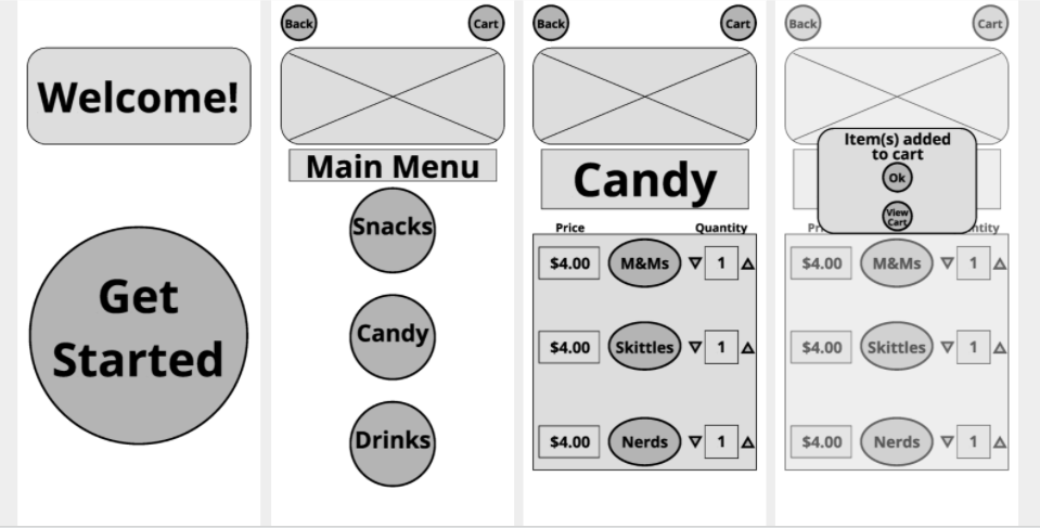
Due to time constraints, I couldn’t onboard myself to Maze, so I created my own usability study using analog methods. With 15 participants, I had each of them attempt to order one item from each menu, and I had each of them attempt to get to the checkout screen. Both tasks had a 100% rate of success, but one pain point I kept hearing from users is that the back and cart buttons were too small. I made this a focus when designing the high fidelity prototype.
Refining the Design
Branding:
Because this is an app that’s going to be used in the middle of a movie theatre, it was important for me to keep a dark color scheme to reduce as much brightness as possible.
Hi-Fi Prototype:
Accessibility:
Accessibility features that I added to this prototype are included within the color scheme. Using Adobe Color, I checked my color palette for conflicts and ensured that the app is color blind safe.
Next Steps:
Given more time, I would have liked to make a profile section that allows users to build up points, redeem rewards, and save frequent orders. I also wanted to include a brightness slider, but I thought it might cause distractions.


