Overwatch 2
Project Overview
The Product
Overwatch 2 is an online multiplayer shooter that released in 2022. This case study highlights improvements I’ve made to the game’s UX and UI as a part of ELVTR’s UX/UI for Gaming course.
The Problem
Because this is for an online course, let’s say as a hypothetical that there were a lot of issues brought up in the last few rounds of usability testing for Overwatch 2.
The Goal
Build a UX for two of the game’s screens from end-to-end that aligns with the developer’s vision. Identify user’s pain points and iterate based on feedback. Ensure it’s accessible to as many people as possible.
My Role
This was a solo project. I did everything from the UX research to the UX/UI design.
Responsibilities
Developed user journeys
Created flowcharts, paper prototypes, & digital wireframes
Conducted usability tests
Developed 2D assets and UI mockups
Accounted for accessibility of users with CVD (color vision deficiency)
Research & Information Architecture
Summary
User journey maps, paper prototypes, and flow charts allowed me to empathize with users and visualize some of the elements needed later on in the design process.
User Journey
Paper Prototype & Flow Chart
Wireframes, Usability Tests, & Iterations
Summary
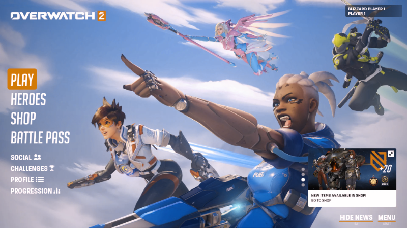
The screens I’m going to be altering are the main menu and the gameplay screen. Due to the fact that this is an existing product, I have a foundation that I can utilize for the usability tests. Below you’ll see my wireframes of the original product, the parameters of the usability tests, and how they influenced my iterations of the design.
Wireframes
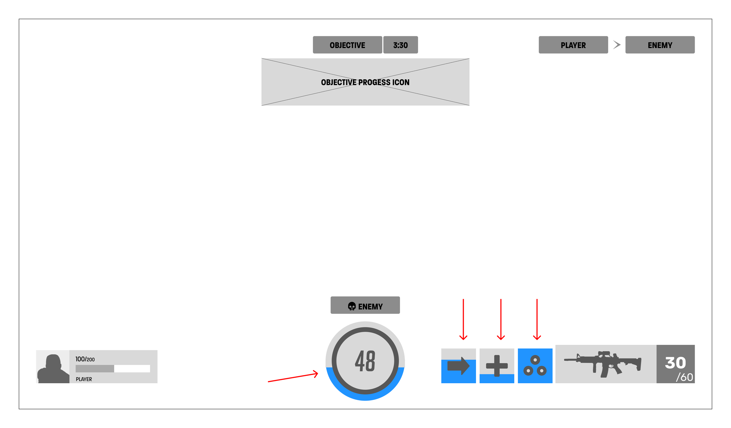
The wireframes below are the screens as they appear in the current version of the game. For the main menu, the buttons are colored blue and the cursor is grey. On the gameplay screen, I recreated all of the UI elements as simply as possible to make it easy to understand.
Main Menu
Gameplay Screen
Usability Tests
Due to this project being a hypothetical situation, Some of the logistics surrounding these tests had to be altered. Below you’ll see my objectives for the tests, the tasks and questions given to the participants, and the findings.
Objectives
Evaluate wireframes (design communication) with players to understand potential miscommunication.
Can players understand all the options on Home Screen without assistance? If not, why?
Can players understand all the options on Gameplay Screen without assistance? If not, why?
How do players feel about the design on both screens?
Iterate design based on the usability test feedback.
Logistics
Recruitment: 10 testers, ages 18-60, no gaming experience needed
Platform: Figma static wireframes
Task Design: Go through both screens, speaking out loud about what options they have and what they mean - prompt testers with tasks from script
Questions
How would describe your experience with this game (Overwatch 2) and video games in general?
Can you go through each screen and discuss what options are available and what they mean to the player?
Can you tell me where both challenge buttons are in the main menu?
Can you tell me what the number 48 represents on the gameplay screen?
Was there anything during the usability test that caused you frustration?
Any other comments or questions?
Outcomes & Iterations
Thanks to the usability study, I determined that users are having a difficult time identifying options available to them in both the home and gameplay screens. Both of the users I tested had issues explaining what the social and challenges icons were in the top right corner of the menu screen. They also had issues identifying how many abilities were available to use in the gameplay screen, as well as what they were. As a designer, I need to go back and iterate some of the icons to make them more easily understood by players. Below, you’ll find the edited wireframes.
Main Menu
Gameplay Screen
Design Inspiration & UI Mockups
Summary
Below you’ll find a moodboard that provided me with good inspiration for how I wanted my designs to look. Since this is an existing product, I had to visually match my UI elements with what came before. The UI mockups I created match the look and feel of Overwatch.
Moodboard
UI Mockups
Main Menu
Gameplay Screen
Accessibility & Next Steps
Accessibility
To make this mockup more accessible, I tested it with different variations of colorblindness to ensure it could still work with users affected.
Trianomaly (Blue-weak)
Tritanopia ( Blue-blind)
Deuteranomaly (Green-weak)
Deuteranopia (Green-blind)
Protanomaly (Red-weak)
Protanopia (Red-blind)
Monochromacy
Blue Cone Monochromacy
Monochrome Fix
Next Steps
Given more time, I would have liked to interview more potential users to get additional feedback. I would have also liked to find other accessibility options to test my designs against.


